Use cases
Introduction
Once in a project, you can go to the “use case” page using lateral navigation and start creating new use cases or explore already existing ones.
Regarding the problematic and the data type you have, several training possibilities are available in the platform :
| Training type / Data type | Tabular | Timeseries | Images | Definition | Exemple |
|---|---|---|---|---|---|
| Regression | Yes | Yes | Yes | Prediction of a quantitative feature | 2.39 / 3.98 / 18.39 |
| Classification | Yes | No | Yes | Prediction of a binary quantitative feature | « Yes » / « No » |
| Multi Classification | Yes | No | Yes | Prediction of a qualitative feature whose cardinality is > 2 | « Victory » / « Defeat » / « Tie game » |
| Object Detection | No | No | Yes | Detection from 1 to n objects per image + location | Is there a car in this image ? If so, where ? |
| Text Similarity | Yes | No | No | Estimate the similarity degree between two text.Find texts that are similar in context and meaning with your queries | « a tool for screws » should lead to a a screwdriver description |
Then, for each data type, you will have to choose between several usecase types demanding a specific configuration for each.
Create a new usecase
In order to create a new usecase using the interface, three possibilities are available :
- In the usecase menu by clicking on the “new usecase” button top right of the screen
- By clicking the actions button of the dataset list and clicking on the “create usecase” button
- On a dataset page by clicking on the “actions” button and select “create usecase” on the menu
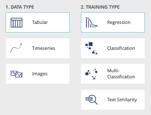
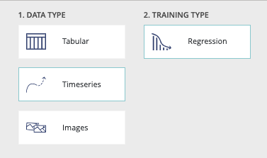
Then you will land on the new usecase page and will have to choose the datatype and the training type regarding your problem.
As training types requires specific configuration, all information needed to start the training of a usecase will be explain on each training type dedicated chapters
Usecase configuration navigation
Once the training options are selected, by clicking on the “next step” button you will be able to navigate and parameter your usecase. The following image shows the navigation menu regarding the use case parameters.

- Configuration : Includes all required parameters such as the file target
- Advanced options : Includes all advanced options such as model selection and feature engineering
Due to specific choices, options will be detailed on specific training sections.
Data Type : Tabular
Introduction
Following tables show you all type of training options for a tabular data type usecases :
| Algorithm | Training : simple | Training : Normal | Training : Advanced | Regression | Classification | Multi-classification | Blend |
|---|---|---|---|---|---|---|---|
| Logistic Model | Yes | No | No | No | Yes | Yes | Yes |
| Linear Regression | Yes | No | No | Yes | No | No | Yes |
| Decision Tree | Yes | No | No | Yes | Yes | Yes | No |
| XG Boost | No | Yes | Yes | Yes | Yes | Yes | Yes |
| Linear Model | No | Yes | Yes | Yes | Yes | Yes | Yes |
| Extra Trees | No | Yes | Yes | Yes | Yes | Yes | Yes |
| Random Forest | No | Yes | Yes | Yes | Yes | Yes | Yes |
| LightGBM | No | Yes | Yes | Yes | Yes | Yes | Yes |
| Neural Network | No | Yes | Yes | Yes | Yes | Yes | Yes |
| CAT Boost | No | Yes | Yes | Yes | Yes | Yes | Yes |
| Naive Bayes | No | Yes | No | No | Yes | Yes | No |
| Models | Tf-Idf | Transformers | Transformers Fine-tuned |
|---|---|---|---|
| Brute Force | Yes | Yes | Yes |
| Cluster Pruning | Yes | No | No |
| IVF OPQ | No | Yes | Yes |
| LSH | No | Yes | Yes |
| HKM | No | Yes | Yes |
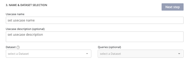
Tabular : usecase information
After selection of data type tabular and training type regression, you will see the following form displayed on your screen.

- Usecase name (mandatory) : usecase name displayed on usecase list
- Usecase description (optional) : helpful to describe differences between versions of a usecase
- Dataset (mandatory) : dropdown list of previously added dataset into the project available as training dataset
- Holdout dataset (optional) : dropdown list of previously added dataset into the project usable as holdout. Holdout dataset is used at the end of the training in order to generate predictions usings created models and calculate a holdout score. If no holdout, the calculated score will be down by creating synthetic holdout from the training dataset
Once mandatory information has been fulfilled, the next step button is enabled and allows you to continue the configuration of your usecase.
Tabular : use case configuration
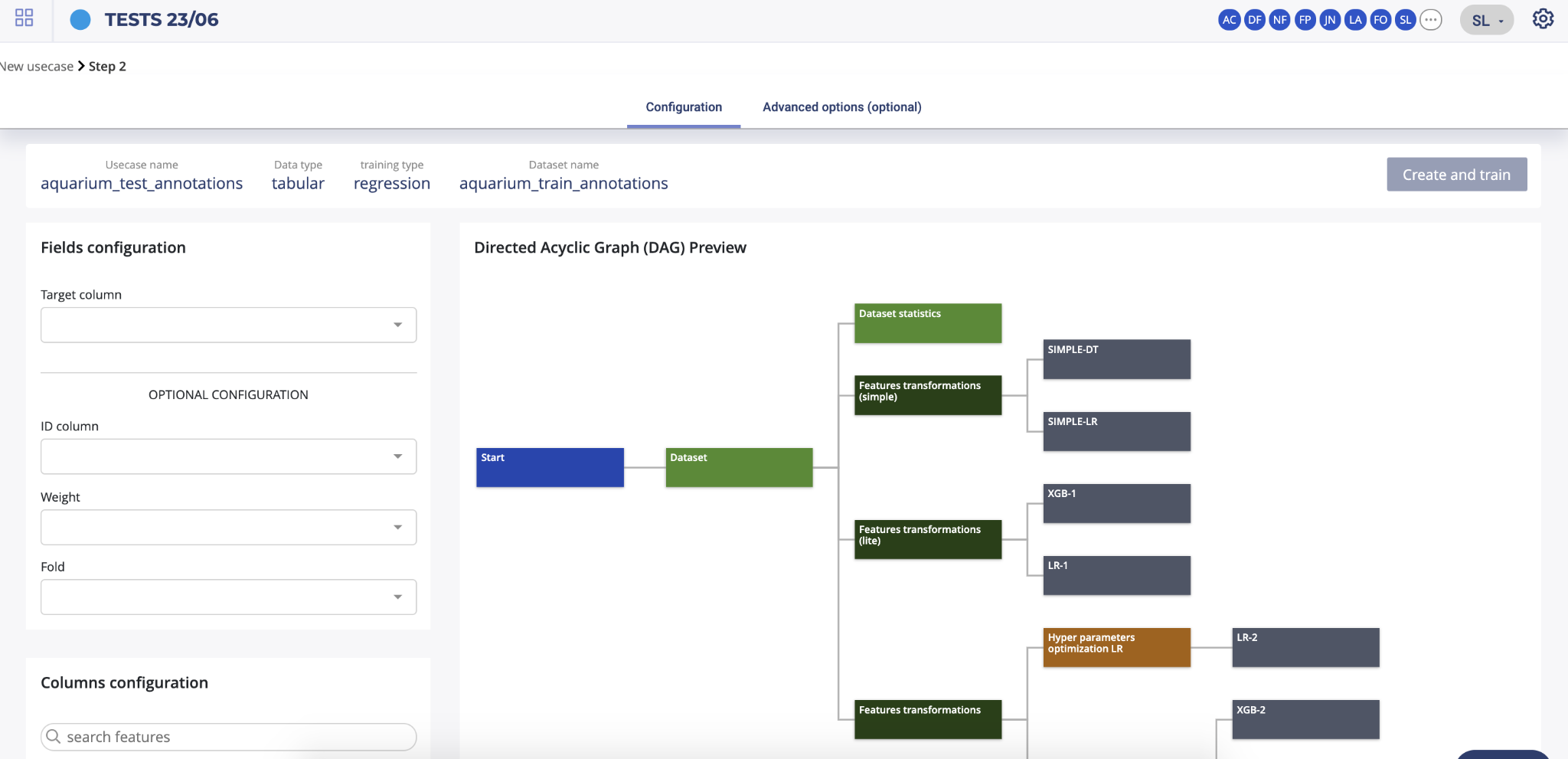
The first step you need to fulfil in order to start the training of your usecase is information regarding the dataset configuration. Two panels are displayed on the left side of your screen. The top one, called “fields configuration” allows you to select :
- Target (mandatory) : the columns containing the truth you want later predict
- ID column (optional) : if your dataset contains one column referencing IDs not interesting for the training, you can automatically, by selecting it, ignore it during training.
- Weight (optional): sometimes, a numerical does not contain an actual feature but rather an indication of how important each row is — if that is the case, you can pass the name of this column as weight_column (the higher the weight, the more important the row — by default, all rows are considered to be of equal importance); note that if this is provided, the optimised metric will become weighted
- Fold (optional): if no “fold” column is provided, a random stratification will be used and will try to force the same distribution of the target between folds. If you want to perform a custom stratification to improve the quality of your validation (which can be misleading if some kind of group structure appears in your data which is not reproduced in the train / test split), you can pass a specific column name to use as reference. The stratification will then ensure that no two samples that have the same “fold id” in the “fold” column will be located in different folds.
The second bottom left panel allows you to ignore some columns of your dataset. To do it, just deselect unwanted features. Please note that you can search by features name the columns you want to unselect and use the “select/unselect all” checkbox to apply your choice to the selection.
The right panel is showing you a preview of the AutoML pipeline that will be performed by Prevision.IO in order to train your usecase.
Tabular : advanced options
By clicking on the advanced options button, you will be able to configure more in detail your training.
Advanced options : Training options
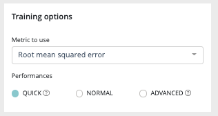
First panel of your advanced option is the training options one allowing you to select the metric to use, depending on your training type, and the training performances you want. In order to know all metrics supported by prevision.IO please refer to the dedicated area of this documentation.
Three type of performances are
- QUICK: Training is done faster but performance may be slightly lower. Ideal in iterative phase.
- NORMAL: Intermediate value, suitable for most usecases on a later stage.
- ADVANCED: The training is done in an optimal way. Though the performance will be more stable, the calculations will take longer to process. This is ideal when the model is put into production and the performance is discriminating.
Advanced options : Feature engineering
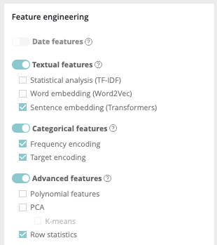
Four kinds of feature engineering are supported by the platform. :
- Date features : dates are detected and operations such as information extraction (day, month, year, day of the week, etc.) and differences (if at least 2 dates are present) are automatically performed
- Textual features : * Statistical analysis using Term frequency–inverse document frequency (TF-IDF). Words are mapped to numerics generated using tf-idf metric. The platform has integrated fast algorithms making it possible to keep all uni-grams and bi-grams tf-idf encoding without having to apply dimension reducing. More information about TF-IDF on https://en.wikipedia.org/wiki/Tf%E2%80%93idf * Word embedding approach using Word2Vec/Glove. Words are projected a dense vector space, where semantic distance between words are : Prevision trains a word2vec algorithm on the actual input corpus, to generate their corresponding vectors. More information about Word embedding on https://en.wikipedia.org/wiki/Word_embedding * Sentence Embedding using Transformers approach. Prevision has integrated BERT-based transformers, as a pre-trained contextual model, that captures words relationships in a bidirectional way. BERT transformer makes it possible to generate more efficient vectors than word Embedding algorithms, it has a linguistic “representation” of its own. To make a text classification, we can use these vector representations as input to basic classifiers to make text classification. Bert (base/uncased) is used on english text and Multi Lingual (base/cased) is used on french text. More information about Transformers on https://en.wikipedia.org/wiki/Transformer_(machine_learning_model). The Python Package used is Sentence Transformers (https://www.sbert.net/docs/pretrained_models.html)
- Categorical features: * Frequency encoding: modalities are converted to their respective frequencies * Target encoding: modalities are replaced by the average (TARGET, grouped by modality) for a regression and by the proportion of the modality for the target’s modalities in the context of a classification
- Advanced features: * Polynomial features: features based on products of existing features are created. This can greatly help linear models since they do not naturally take interactions into account but are less usefull on tree based models * PCA: main components of the PCA * K-means: Cluster number comming from a K-means methode are added as new features * Row statistics: features based on row by row counts are added as new features (number of 0, number of missing values, …)
Please note that if you don’t have a feature of one of these feature types in your train dataset, the corresponding feature engineering toggle button will be disable. Also please note that textual features pretreatments only concerne advanced models and normal Naive Bayes model
Advanced options : Model selection
The model selection area allows you to select the type of model you want to train. In order to know precisely which models you can train for each training type, please refer to the model matrix at the begininng of the tabular datatype chapter.

By enabling the “blend” toggle, the platform will create blended models based on the model selection you choose.
Advanced options : Feature selection
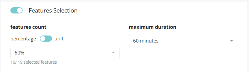
In this part of the screen you can chose to enable feature selection (off by default).
This operation is important when you have a high number of features (a couple hundreds) and can be critical when the number of features is above 1000 since the full Data Set won’t be able to hold in RAM.
You can chose to keep a percentage or a count of feature and you can give a time budget to Prevision.io’s to perform the search of optimal features given the TARGET and all other parameters. In this time, Prevision.io will subset the feature of the Data Set then start the classical process.
The variable selection strategy in Prevision.io is hybrid, depends on the characteristics of the dataset and the time available.
- It is hybrid because it combines both so-called filtering methods, encapsulation methods and integrated methods. The filtering methods perform the selection of entities independently of the construction of the classification model. Encapsulation methods iteratively select or eliminate a set of entities using the metric of the classification / regression model. In built-in methods, feature selection is an integral part of the classification / regression model.
- It depends on the characteristics of the dataset and the time
allotted. In fact, depending on the volume of the dataset, a small
data strategy is applied for a dataset of less than 8 GB, fully in
memory. Otherwise, a big data strategy is applied.
- In a small data situation, a first filtering approach is carried out consisting in filtering the variables of zero variance, the duplicated variables, the intercorrelated variables beyond 99% and the variables correlated to the target variable beyond 99% . Depending on the time remaining available, a second so-called encapsulation method is carried out using a LASSO-type regularization on the entire dataset by cross validation with the aim of optimizing the metric selected when the use case is launched.
- In a big data situation, as time permits, several row and column samplings are carried out and the stages of filtering, encapsulation method and integrated methods completed by a reinforcement learning strategy are successively launched. . The variables are then ranked in order of priority according to the different approaches tested and the top variables, at the threshold defined by the user, are sent to the various algorithms of Prevision.io.
Tabular text similarity introduction
Even if considered as a training type for tabular data type, text similarity usecases are particular and need specific training options.
First, instead of a holdout dataset, a queries dataset (optional) can be selected.
Tabular text similarity dataset configuration
The second step of a text similarity training will allow you to configure the fields for the training dataset and the queries dataset (if added on the previous step).
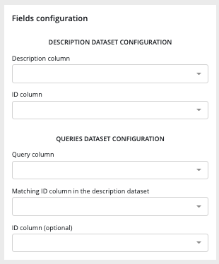
- Description dataset configuration :
- description column : textual description column of the dataset
- ID column : item ID
- Queries dataset configuration :
- Query column : column containing the queries
- Matching ID column : column allowing the platform to match a query from the queries dataset to a description from the description dataset
- ID column (optional) : ID of the queries
Please note that only these 3 columns from your queries dataset will be considered during the training.
Tabular text similarity advanced option
text similarity training options
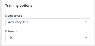
Two training options dropdown have to be configured before training :
- the metric to use in order to compute the models scores
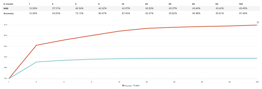
- Accuracy at k: Is the real item corresponding to a query present in the search result, among the k items returned? The value is a percentage calculated on a set of queries.
- Mean Reciprocal Rank (MRR) at k: Similar to accuracy at k. However the score for each query is divided by the rank of appearance of the corresponding item. Example: If for a query the corresponding item appears in third position in the returned list, then the score will be ⅓ . If it appears in second position the score will be ½, in first position the score will be 1, etc. https://en.wikipedia.org/wiki/Mean_reciprocal_rank
- K results : the number of query like items that the tool must return during a search. Value between 1 and 100.
Text similarity Preprocessing
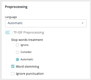
Several preprocessing options are available :
- Language : you can force the training dataset language to english or french or, let the platform determines by itself between these two languages
- TF-IDF preprocessing :
- Stop words treatment : you can choose if the platform has to ignore or consider the stopwords during the training. As for the language, you can also let the system makes it own decision by selecting “automatic”
- Word stemming : stemming is the process of reducing inflected (or sometimes derived) words to their word stem, base or root form—generally a written word form.
- Ignore punctuation : by activating this option, the punctuation will not be considered during the training
Text similarity model selection
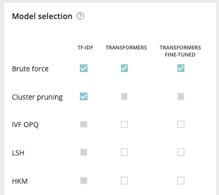
Text similarity module is composed of 2 kinds of models :
- embedding model to make a vector representation of your data
- search models to find proximity between your queries and product database
Embedding model / word vectorization: (https://fr.wikipedia.org/wiki/Word_embedding)
Term Frequency - Inverse Document Frequency (TF-IDF): Model representing a text only according to the occurrence of words. Words not very present in the corpus of texts will have a greater impact. https://fr.wikipedia.org/wiki/TF-IDF
Transform: Model representing a text according to the meaning of words. In particular, the same word will have a different representation according to the other words surrounding it.
https://en.wikipedia.org/wiki/Transformer_(machine_learning_model)
Transformer feature-based: Transformer that has been trained upstream on a large volume of data, but has not been re-trained on the corpus in question.
Fine-tuned transform: A transform that has been trained on a large volume of data and then re-trained on the text corpus in question.
Search models :
Brute Force: Exhaustive search, i.e. each query is compared to the set of item descriptions.
Locality sensitive hashing (LSH): exhaustive search. Vectors are compressed to speed up distance calculations.
https://fr.wikipedia.org/wiki/Locality_sensitive_hashing
Cluster Pruning: non-exhaustive research. Item descriptions are grouped by cluster according to their similarity. Each query is compared only to the queries of the closest group.
https://nlp.stanford.edu/IR-book/html/htmledition/cluster-pruning-1.html
Hierchical k-means (HKM): non-exhaustive research. The idea is the same as for the previous model, but the method used to group the items is different.
InVerted File and Optimized Product Quantization (IVFOPQ): non-exhaustive search. The idea is the same as for the two previous models, but the method used to group the items is different. Vectors are also compressed to speed up distance calculations.
As you can see in the DAG, in order to train a text similarity model, text embedders have to be done but some of them are not compatible with models. Here is all the combination text embedder/model you will be able to perform in the platform :
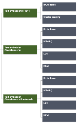
Please note that in order to guarantee the performance of IVF-OPQ models, a minimum of 1000 unique IDs in the train dataset is required.
Datatype time series
Introduction
In the prevision.io platform you have the possibility to train time series usecase in order to do forecasting predictions. By selecting in the new usecase screen the timeseries data type you will access the timeseries usecase configuration.
Timeserie usecase configuration
Time series is very similar to tabular usecase except:
- There is no hold out
- There is no weight
- There is no fold (in this case, Prevision.io use temporal stratification)
However, you will find some new notions:
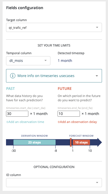
- Temporal column: the feature that contains the time reference of the time series. Since date formats can be complex, Prevision.io supports ISO 8601 (https://fr.wikipedia. org/wiki/ISO_8601) as well as standard formats (e.g. DD/MM/YYYY or DD-MM-YYYY hh:mm).
- Time step: period between 2 events (within the same group) from the temporal column (automatically detected)
- Observation window: illustrate the period in the past that you have for each prediction * Start of observation window: the maximum time step multiple in the past that you’ll have data from for each prediction (inclusive, 30 by default) * End of the observation window: the last time step multiple in the past that you’ll have data from for each prediction (inclusive, 0 by default that means that the immediate values before the prediction time step is known)
- Prediction window: illustrate the period in the future that you want to predict * Start of the prediction window: the first time step multiple you want to predict (inclusive, 1 by default which means we will predict starting at the next value) * End of the prediction window: the last time stamp multiple you want to predict (inclusive, 10 by default which means we will predict up to the 10th next value)
- A priori features: features whose value is known in the future (customer number, calendar, public holidays, weather…)
- Group features: features that identify a unique time serie (e.g. you want to predict your sales by store and by product. If you have 2 stores selling 3 products, there are 6 time series in your file. Selecting features « store » and « product in the group column allows Prevision.io to take into account these multiple series)
Please note that advanced options work the same way than for tabular usecases. Please read the corresponding readthedoc section in order to configure your time series usecase.
Usecases images
In the prevision.io platform, you can train several usecases type using images :
regression classification multi-classification image detection
For the first three kinds of training, the user flow is similar to the corresponding tabular usecases. You will just need in addition to add an image folder corresponding to the train dataset in the new usecase screen.

Image usecases configuration
The image usecases training workflow is similar to the tabular corresponding usecases (except for image detection). Please refer to the tabular datatype training read the doc section in order to get information about the train settings. However this similarity, some differences are notable. On the field configuration options, an image path is required.This image path is the link between the tabular train dataset and the corresponding images.
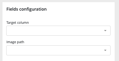
Image detection usecases Introduction
In the prevision.io platform, a particular kind of image usecase allows you to train models that are able to recognize and boxing on an image a particular object.
In order to train image detection usecases you will need to have an image folder and a tabular document including :
- the image path
- the object label
- the bounding box coordinates
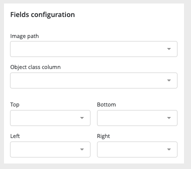
The image detection usecase training configuration is simpler than for other training. In advance options, only training performances choice between quick, normal & advanced is available.
versioning of a usecase
In the prevision.IO platform you can create multiple versions of one usecase allowing you to search for optimal performance training and, deploy and switch any model from any version of the same usecase.
In order to do that, several possibilities :
- From the usecase list, by clicking on the “action button” of an entry and selecting “new version”
- one a usecase page, by clicking on the “action” button and selecting “new version”
- On the version menu from a usecase and selecting “new version” in the list action button
Then, you will be redirected to the “new usecase” page but with limited option. First of all, you can not change the datatype and training type between version
duplication of a usecase
In order to duplicate a usecase, there is two options :
- by using the action button right side of the usecase list
- by using the “action button” on top right of any usecase page and select “duplicate usecase”
By doing this, the new usecase screen will appear keeping the duplicated usecase configuration.
Usecase general navigation
navigation
For each training type (except image detection usecases) you will find the same navigation allowing you to explore your usecase and models.

image alt text
- General : general information and comparison of your models in terms of performances
- models : list view of the created models and information about the trained models
- Features : information about the dataset used for the training and the configuration of the feature engineering
- Prediction : create bulk predict using CSV files and view all bulk prediction done for this usecase
- Task : DAG and listing of all operations done during training
- Versions : list of all version of the selected usecase
- Report : generate PDF reports explaining the models/usecases
General
In this menu, you will find general information about your usecase such as the list of created models.
- The information header gives you the important information regarding your usecase. You can expand this panel by clicking on “more information”. Please note that by default, by entering a usecase, the information will be all about the latest version of the usecase. You can navigate through the versions using the dropdown list on the left side of this panel.
- Action button : on the right side of the information panel, you will
find the actions buttons allowing you to :
- edit the name and description of the usecase version
- create a new version
- duplicate the usecase
- delete the usecase
- Under the information panel, cards displaying information regarding your usecase are displayed. Please note that the holdout score card will be displayed only if a holdout was selected during training configuration
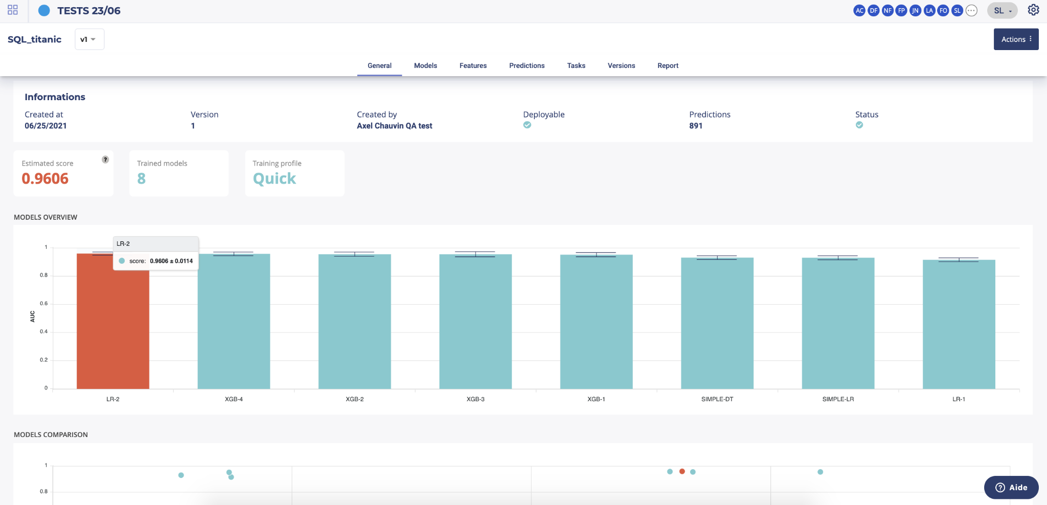
- Two graphs are displayed on the general page of a usecase showing :
- The models ranked by score. By clicking on a model chart bar, you can access to the selected model details
- Models score vs. estimated prediction time
Please note that for object detection, the general screen is quite different from the other use cases types. On the image detection general menu you will find a sample of images used during the train in orange, the predicted bounding boxes using cross validation and in blue, the true bounding boxes.

models
By clicking on the models menu of top usecase navigation, you will access the model list trained for this usecase version. you will also, at the bottom of the page, find information regarding the model selected for this train.
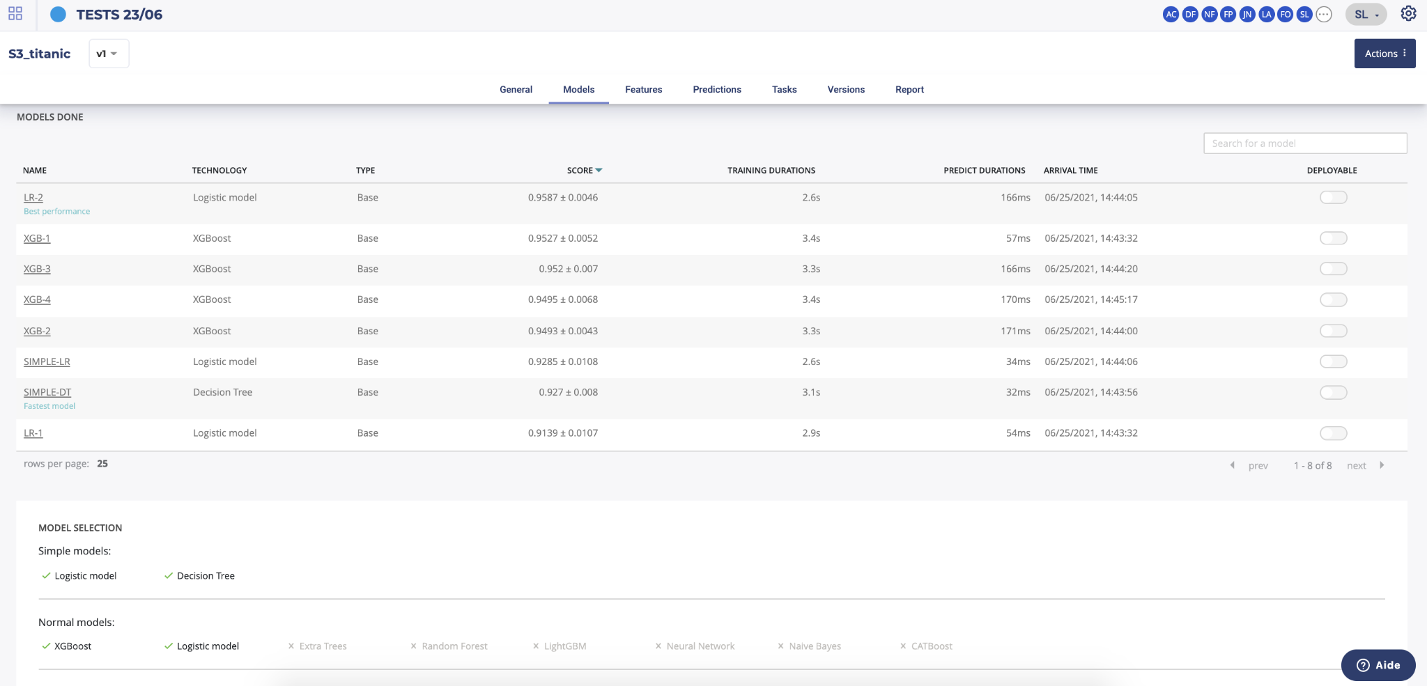
By clicking on the model name in the list, you will be redirected to the model detail page. Please note that a toggle button is available on the right side of the list for each model. This toggle allows you to tag a model as deployable. In order to know how to deploy a model, please go to the dedicated section.
features
In this section you will find any information relative to the dataset used during the train.

On the top panel, you will find generic information about the dataset used during the train such as the number of columns, number of samples and number of cells or the usecases using this dataset.
You can also download the dataset used for the training by clicking on the “download dataset” button on top of the page.
Two graph are also displayed showing :
- the feature distribution regarding the feature type (linear, categorial, date or text). This distribution is automatically calculated when uploading a dataset into the platform
- correlation matrix showing the correlation coefficients between variables. Each cell in the table shows the correlation between two variables
Under this top panel, three tabs are available :
- Features analysis : table displaying features information calculated after the upload of the dataset such as the % of missing value.
- Drop features : In this tab, you will find a list of all features you dropped for the usecase training during the usecase configuration
- Configuration : list of all feature engineering applied on the dataset during training
predictions
The predictions menu allows you to do bulk predictions using a previously loaded dataset and see holdout predictions made during training.
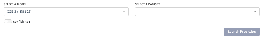
In order to do a new prediction, you have to first select a model from the dedicated dropdown list and then a dataset uploaded on the project. Then, by clicking on the “launch prediction” button, the system will compute and generate a prediction file downloadable by clicking on the right side button on the prediction list below.
Prediction explain
You can make more in-depth analyses of the predictions made this way by generating explanations for each of the predictions of the dataset. You can access the explanation screen by clicking on the |image alt text|menu on the table entry for the prediction you wish to explain. (Depending on the complexity of the model and the size of your dataset, the screen may take a few seconds to load).
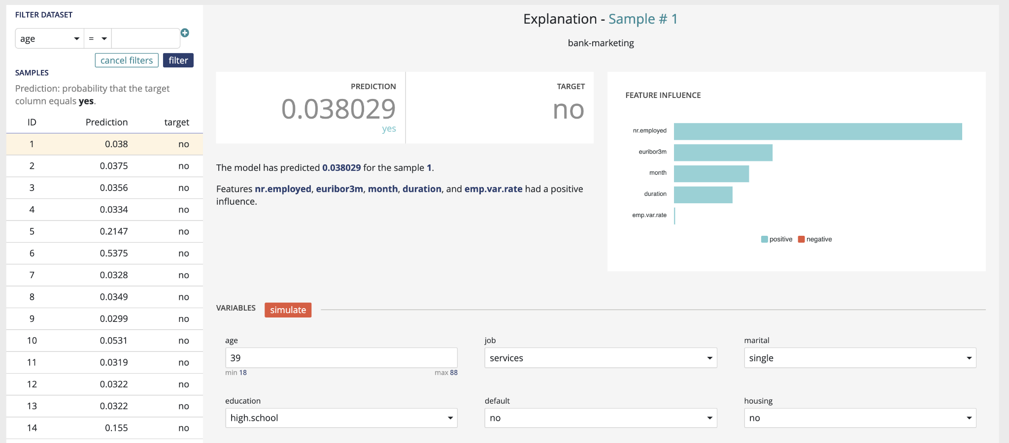
The explanation screen is composed of three parts :
- The “filter dataset”, on the left, that allows you to select a specific prediction from your dataset to be explained, as well as apply specific filters to the dataset to select predictions you are interested in. A filter is defined as :
- a variable present in your dataset (selected from the dropdown)
- an operator
- a value. All rows matching the clause will be returned. You can apply up to two filters, and select whether both filters should be applied (“and”), or if a row matching any of the two filters should also be returned (“or”).
- The “explanation”, on the top right, displays the prediction for the currently selected line, the actual value of the target variable (if it was present in the dataset), as well as the explanation, shown as the relative impact (which can be positive or negative) of the different variables on the final decision.
- The “variables” part, on the bottom right, allows you to conduct “what-if” analyses and see how the prediction and explanations can evolve when the values of the variables are adjusted. When you click on the “simulate” button, the prediction & explanation above will be updated.
tasks
In this menu you will find an overview of all tasks made by the platform during the usecase training and their status. The aim of this screen is to help you to better understand the operations made during the training and, if errors occurred, at which level it happened.
For that, two views are available :
- Liste view : list all single operations done
- DAG view : graphical view of single operations and their relation
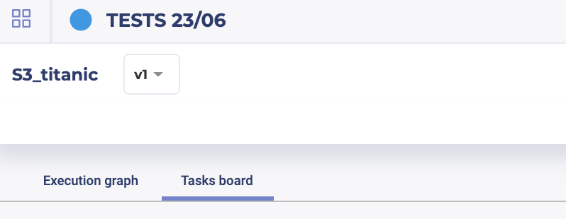
You can switch between these views by clicking on the execution graph / tasks board tabs.
versions
In the Prevision.IO platform you can iterate versions of your usecases. To do that, three possibilities :
- On the usecase list of a project, by clicking on the right side action button of the usecase you want to iterate and select “new version”
- On any pages of a usecase by clicking on the top right “actions” button and select new version
- On the “Version” menu of a usecase, by clicking on the action button right side of a version listed and select “new version”
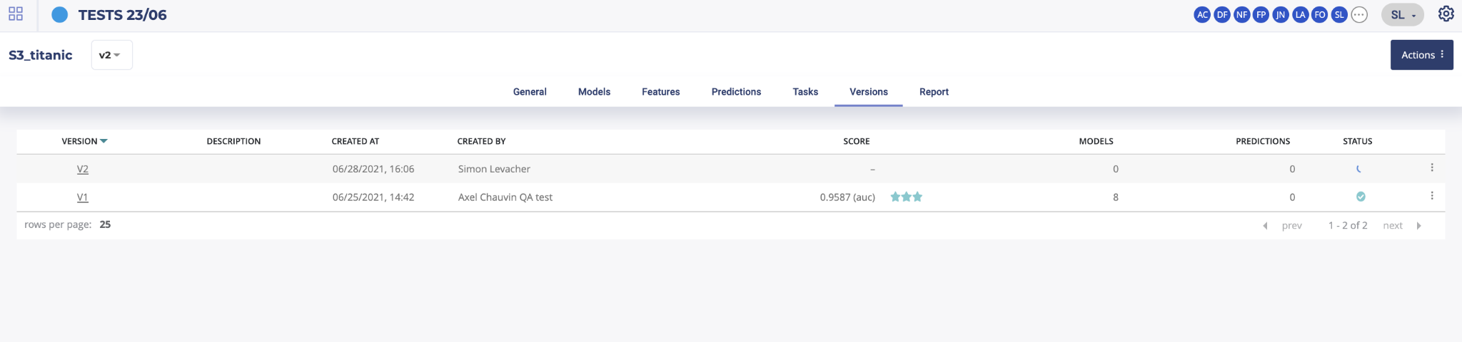
Then, on the version menu of a usecase, you will find the list of all trained versions for this usecase. By clicking on the version number, left side of this list, you will access the selected usecase version page. You can also navigate through versions by using the dropdown list top left of the information banner on any page of a usecase.
After clicking on a new version button, you will be redirected to the usecase configuration menu. The usecase version configuration you selected for your iteration will be automatically loaded in order for you to know what configuration was done and select the changement you want to apply.
TIPS : when creating a new usecase or a new version, add a description to your usecase at the first screen of new usecase configuration. It will help you finding the version you want to work with later.
report
In this menu, you can generate PDF reports regarding models from the usecase. To do that, once on the dedicated model menu, you will have to choose from the drop down the models you want to appear in the generated report and the feature importance count. You also can select explanations by check/uncheck the show explanation checkbox. Then, by clicking on the generate button, you will get an overview of the report. By clicking on the “print” button on the top of the overview, you will download the PDF report.
models pages
Each model page is specific to the datatype/training type you choose for the usecase training. Screens and functionality for each training type will be explained in the following sections. You can access a model page by two ways :
- by clicking on a graph entry from the general usecase page
- by clicking on a list entry from the models top navigation bar entry
Then you will land on the selected model page splitted in different parts regarding the training type.
tabular usecases - general information
For each kind of tabular training type, the model general information will be displayed on the top of the screen. Three sections will be available.
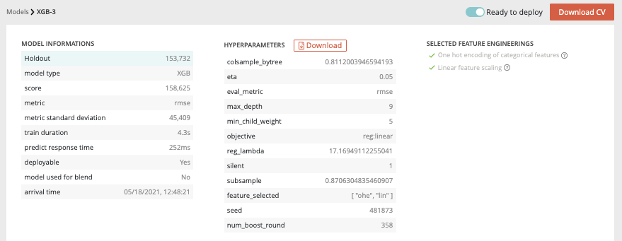
- Model information : information about the trained model such as the selected metric and the model score
- Hyperparameters : downloadable list of hyperparameters applied on this model during the training
- Selected feature engineerings (for regression, classification & multi-classification) : features engineerings applied during the training
- Preprocessing (for text similarity usecases) : list of pre-processing applied on textual features
Please note that for following usecases types, the general information parts is different than from others :
- Image detection usecases : no feature engineering
- text similarity usecases : preprocessing are displayed instead of feature engineering
Model page - Graphical analysis
In order to better understand the selected model, several graphical analyses are displayed on a model page. Depending on the nature of the usecase, the displayed graphs change. Here an overview of displayed analysis depending on the usecase type.
| Tabular regression | Tabular classification | Tabular multi-classification | Tabular text similarity | Time series regression | Image regression | Image classification | Image multi-classification | Image detection | |
|---|---|---|---|---|---|---|---|---|---|
| Scatter plot graph | Yes | No | No | No | Yes | Yes | No | No | No |
| Residual errors distribution | Yes | No | No | No | Yes | Yes | No | No | No |
| Score table (textual) | Yes | No | No | No | Yes | Yes | No | No | No |
| Residual errors distribution | No | No | No | No | No | No | No | No | No |
| Score table (overall) | No | No | Yes | No | No | No | No | Yes | No |
| Cost matrix | No | Yes | No | No | No | No | Yes | No | No |
| Density chart | No | Yes | No | No | No | No | Yes | No | No |
| Confusion matrix | No | Yes | Yes | No | No | No | Yes | Yes | No |
| Score table (by class) | No | Yes | Yes | No | No | No | Yes | Yes | No |
| Gain chart | No | Yes | No | No | No | No | Yes | No | No |
| Decision chart | No | Yes | No | No | No | No | Yes | No | No |
| lift per bin | No | Yes | No | No | No | No | Yes | No | No |
| Cumulated lift | No | Yes | No | No | No | No | Yes | No | No |
| ROC curve | No | Yes | Yes | No | No | No | Yes | Yes | No |
| Accuracy VS K results | No | No | No | Yes | No | No | No | No | No |
Model page - graphs explanation
Then the feature graphs will be displayed (not for text similarity) allowing you to see the influence of features for the selected model. Two graphs are accessible through the two features tabs :
- Feature importance : graph showing you the importance of the dataset features. By clicking on the chart, you will be redirected to the dedicated feature page.
- Feature engineering importance : showing you the importance of selected feature engineering.
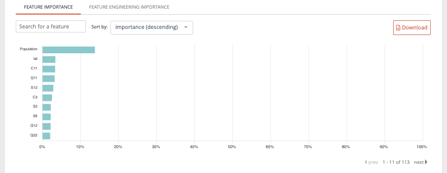
Please note that the feature importance graph also takes into account the feature engineering importance. For example, if a feature n°1 has not so much influence by itself regarding the model but, after feature engineering has a great influence, it will be represented on the feature importance graph.
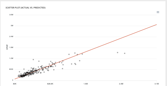
- Scatter plot graph : This graph illustrates the actual values versus the values predicted by the model. A powerful model gathers the point cloud around the orange line.
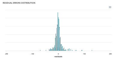
- Residual errors distribution : This graph illustrates the dispersion of errors, i.e. residuals. A successful model displays centered and symmetric residues around 0.
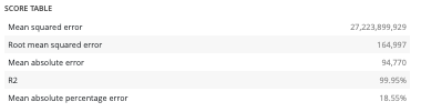
- Score table (textual) : Among the displayed metrics, we have:
- The mean square error (MSE)
- The root of the mean square error (RMSE)
- The mean absolute error (MAE)
- The coefficient of determination (R2)
- The mean absolute percentage error (MAPE)
Please note that you can download every graph displayed in the interface by clicking on the top right button of each graph and selecting the format you want.
- Slider : For a binary classification, some graphs and scores may vary according to a probability threshold in relation to which the upper values are considered positive and the lower values negative. This is the case for:
- The scores
- The confusion matrix
- The cost matrix
Thus, you can define the optimal threshold according to your preferences. By default, the threshold corresponds to the one that minimizes the F1-Score. Should you change the position of the threshold, you can click on the « back to optimal » link to position the cursor back to the probability that maximizes the F1-Score.

- Cost matrix : Provided that you can quantify the gains or losses associated with true positives, false positives, false negatives, and true negatives, the cost matrix works as an estimator of the average gain for a prediction made by your classifier. In the case explained below, each prediction yields an average of €2.83.
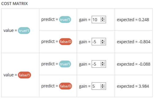
The matrix is initiated with default values that can be freely modified.
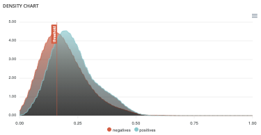
- Density chart : The density graph allows you to understand the density of positives and negatives among the predictions. The more efficient your classifier is, the more the 2 density curves are disjointed and centered around 0 and 1.
- Confusion matrix : The confusion matrix helps to understand the distribution of true positives, false positives, true negatives and false negatives according to the probability threshold. The boxes in the matrix are darker for large quantities and lighter for small quantities.

Ideally, most classified individuals should be located on the diagonal of your matrix.
- Score table (graphical) : Among the displayed metrics, we have:
- Accuracy: The sum of true positives and true negatives divided by the number of individuals
- F1-Score: Harmonic mean of the precision and the recall
- Precision: True positives divided by the sum of positives
- Recall: True positives divided by the sum of true positives and false negatives

- Gain chart : The gain graph allows you to quickly visualize the optimal threshold to select in order to maximise the gain as defined in the cost matrix.

- Decision chart : The decision graph allows you to quickly visualize all the proposed metrics, regardless of the probability threshold. Thus, one can visualize at what point the maximum of each metric is reached, making it possible for one to choose its selection threshold.

It should be noted that the discontinuous line curve illustrates the expected gain by prediction. It is therefore totally linked to the cost matrix and will be updated if you change the gain of one of the 4 possible cases in the matrix.
- lift per bin : The predictions are sorted in descending order and the lift of each decile (bin) is indicated in the graph. Example: A lift of 4 means that there are 4 times more positives in the considered decile than on average in the population.
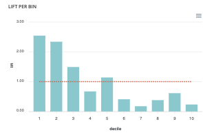
The orange horizontal line shows a lift at 1.
- Cumulated lift : The objective of this curve is to measure what proportion of the positives can be achieved by targeting only a subsample of the population. It therefore illustrates the proportion of positives according to the proportion of the selected sub-population.
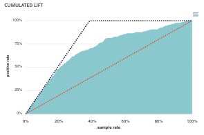
A diagonal line (orange) illustrates a random pattern (= x % of the positives are obtained by randomly drawing x % of the population). A segmented line (blue) illustrates a perfect model (= 100% of positives are obtained by targeting only the population’s positive rate).
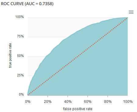
- ROC curve : The ROC curve illustrates the overall performance of the classifier (more info: https://en.wikipedia.org/wiki/Receiver_operating_characteristic). The more the curve appears linear, the closer the quality of the classifier is to a random process. The more the curve tends towards the upper left side, the closer the quality of your classifier is to perfection.
- Accuracy VS K results : this graph shows the evolution of accuracy and MRR for several value of K results